Monsieur Salut writes: each close-season, we see a new set of SAFC kits. Each season, they divide opinion. I am clearly in a minority in liking, at least a little, the new home top. You may well disagree with me. Read on and have your say …
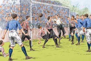
What you see above is not the new Sunderland home kit, the one generating such strong protests, but a markedly similar one from the days when our team was a force in the land, the Team of All the Talents no less. Check out a great description of historic strips at http://ryehillfootball.co.uk/art/the-art-of-sunderland-afc/.
Whenever we remind brand supporters – Man U and C, Chelsea, Liverpool, Chelsea, Spurs etc – that we’ve won six top flight titles, we must remember also that half of the titles were secured in the century before last. And what you see above is how we looked back then …
[polldaddy poll=9766785]
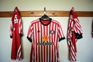
And this is how we will look at home next season as we strive for a lesser title, that of the Championship.
SAFC launched the kit with a Facebook-screened clip of Dawdon Welfare Park FC of the Peterlee and District Sunday League wearing it as they beat Hall Farm Glasshus FC of the Durham Alliance Combination League 7-1 at Ashbrooke Cricket Club – the site of one Sunderland AFC’s former grounds prior to its move to Roker Park in 1898.
Paul Welch of Dawdon Welfare Park said: “It was a huge honour for us to be chosen to unveil the new Sunderland home kit. For the club to recognise and celebrate grassroots clubs and players in this way is fantastic and it’s something we will remember for the rest of our lives. The kit is great and we all love it.”
For the club, the new top’s roots are “steeped in shirts from the 1880s”. “Since the club was formed in 1879, the stripes have taken on many guises – wide, narrow and even pin-stripes. The new look, featuring narrower stripes as worn during the historic era, the shirt has a black round neck and black cuffs on the sleeves. The front features the logo of principal partner Dafabet.
“The shirt is complemented by black shorts with red stripes. The kit also features black socks with a red and white turnover cuff.”
Yes, we could all do without the Dafabet logo. But that’s the way the world is. And is the shirt really so terrible?
This may – sorry, does – place me, along with Paul Welch from Dawdon, out on a limb. But I quite like it. It does seem to me to hark back to an early, golden era for our club. And I especially like the fact that there are more stripes than we’ve become accustomed to, even if I very much dislike the all-red back of the shirt.
That, I realise, is a minority view. People I like and respect have been hard on it. Rob Hutchison said it was “rank”, Paul Summerside declared it “horrific! A pub team models a pub team kit!”
Barry Emmerson was more scathing still: “We have put up with some horrendous performances over the years. We have supported our team through a little good but mostly bad, we have renewed our season tickets with blind faith but we have been there in huge numbers to see our team run out in proper red and white stripes and if this is the new strip then our club is a disgrace to our tradition.
“Who on earth sanctioned this? What a joke. Mr (Martin) Bain, you as chief executive who has only been here a year. Would you have dared to allow this to happen at Rangers, do we not mean anything as supporters to have to watch Sunderland run out in this deckchair attire? Shocking,scandalous and soul-destroying. How much more do we have to take?”
All of which makes my qualified support – I cannot say I’m deeply in love with it but I don’t get the ferocity of the criticism – seem a little isolated.
Have your say in the poll. You can add your alternative answer.
[polldaddy poll=9766785]
* Thanks to SAFC for permission to reproduce the images. Pre-order at www.safcstore.com or in club stores located at the Stadium of Light, Debenhams in Sunderland and The Galleries, Washington. Release date: June 29
** And let Rob Hutchison , absolutely no fan of the new top, have another kit-related whinge:
Rob’s insolent take on the new home shirt
Olivia
As another symptom of the club getting it wrong, my daughter @Livvhutchison bought an away top in the recent sale, an apparent bargain at £18.79. Three weeks later and the shirt is now on sale for just a tenner.Irritated, I emailed the club pointing out recent buyers were well out of pocket on this and what would they consider doing with the overpaid £8.79. They’d offer a refund if it was within 14 days and unworn which they must do under distance selling regulations. But shirts are sold to be worn and as it’s past two weeks, I questioned whether or not they fancied any goodwill under the circumstances.
No, nothing, not interested. Never mind the 15 away trips watching absolute garbage this year, and the previous hundreds of pounds spent in recent years with the club.
You carry on looking after your loyal “customers”, that’s what we are right ?
Martin Bain &=and Co, carrying on where others left off?
The club won’t comment on such matters – which Monsieur Salut feels is not only unnecessary but unwise – but apparently takes the view that it boils down to fairly standard practice for any retail outlet, which has regular sales as items are reduced and then further reduced when stock has to be moved.
14 thoughts on “Sunderland’s controversial new strip: your chance to counter my politically incorrect view”
As far as I can tell there isn’t a regulation that insists the back is a single colour and I can’t imagine Celtic changing their kit. But what there is, is a requirement that numbers and players’ names are in a contrasting colour and clearly visible.
That means a panel (say white) with the name and another with the number in black would be acceptable.
With the stripes on this kit being so narrow it is obviously easier to have a plain red back with white numbers and names.
Mind you I might be wrong but I still don’t like the strip.
I am not sure the plain block of colour is UEFA or FIFA, it seems to be a premier league directive that none of us heard about until now.
Which reminds me of the fact FIFA insisted at the last world cup that all teams should play in a single colour, so that tv could easily identify the teams….so, we have 500 billion pixels per square millimetre on HD TV, all singing all dancing curvy laser driven mega LED too, and the prats think this technology can’t differentiate different coloured tops and shorts or stripes?
Maybe they don’t have such great tvs in tax havens like Monaco, as opposed to Witherwack.
The new strip is not a bit of deference to the glory days of the 19th century, it’s an abortion. I defy anyone to see more than 6 red stripes on the ancient shirt, and in my opinion that’s the limit.
Why on earth they insist on putting black on the shirt…it’s funereal.
New shirt is hideous and I wrote to the club to tell them that when they sent me an email proudly proclaiming it. Completely ignored.
Back is hideous, front little better.
Someone must be having a laugh with the UEFA directive as they cannot tell teams what strips to wear. Also, why does the ref have to clearly see from a distance who is doing anything? Just walk over and book them instead of waving a card from a distance like an overblown prima donna. If that means that they then realise they have already been booked (and obviously play for a top 6 club) then perhaps they can’t let them off as they always seem to do.
“They cannot tell teams what strips to wear.” Unfortunately they can. All UEFA competitions have rules and guidelines which you must adhere to if you want to play in that competition. Rules regarding visibility of numbers/names etc is in there. I can’t be arsed to look for the specific rule but someone will.
Not a huge fan of the new shirt. Too many stripes. Red back doesn’t look like Sunderland.
However! I’m not as bothered about the shirt as I am worried about who’s going to be employed to wear it next season, and why it’s taken three weeks to not get a new manager in.
In my opinion the biggest factor in SAFC getting relegated last season was the inactivity in the summer transfer market while we scrabbled around for a new manager. I fear this same managerless paralysis is going to have a profound effect on our 2017-18 season….
“fairly standard practice for any retail outlet”.
Is that what we are now?
Am I seriously expected to support a retail outlet?
I assume the kits are designed by employees of the manufacturers and that the club have little say other than to deliver the brief of the main colours of the 1st choice kit.
This one looks to me like a rehash of an old Brentford, Sheffield United or Cheltenham kit.
Don’t like it and am not looking forward to the release of the brown and yellow check change kit with luminous orange shorts and pink and green hooped socks.
OMG I’ve just had a thought and we could end up with one like Huddersfield’s garish yellow. Still if that happens the players will probably spend half the game trying to pass to one of the stewards and so have a chance of finding a team mate.
I can’t really get too fussed about a strip, though I don’t like the back. Last year’s effort, red and white stripes with a khaki trim, I thought was hideous. What is really telling is that there were no Sunderland players to model it. It’s nice to have grassroots clubs brought in to the mix and I applaud Dawdon Welfare Park FC for doing their bit, but my feeling is that it was a way of getting out of an embarrassing situation where nobody knows who’s going to be here to wear the strip next season, except da da -George Honeyman!! Logging in to the SAFC website (you have to feel for the staff) in the couple of weeks after the season ended there was GH article after GH article, analysis, comments, opinion on climate change, the only reason being, he is a dead cert for next season, and now, two or three weeks on they have let go of that and now it’s the ladies’ team’s turn under the microscope, I don’t begrudge them the attention at all, but to me it just underlines the fact that SAFC is just treading water, directionless, nothing to report.
I hope I’m proved wrong and we’re headline news tomorrow.
Screw UEFA, screw FIFA, screw the FA, screw the brain dead, half-blind referees, we play in red and white stripes, back AND front!!!!
Whether you like it or not the shirt is only as good as the player wearing it. Last season the majority of players weren’t fit enough to wear a SAFC top. Next season –new start–new players -new manager -new owners, so if the new strip truly represents such radical change I like it already.
It will sell in vast numbers as all strips do. Not as bad as some I’ve seen (mainly away tops). Yet, all those stripes and they still can’t get the red one in the middle! The plain back is some kind of new directive as apparently referees (sponsored by Specsavers) were unable to make out names and/or numbers on stripey kits.
Well, if its true and the Refs did have a problem with reading names (and lets face it they have problems with just about everything) then yes we should all change everything to accommodate these prima donnas of the whistle……not.
How about we tell them where to go and how to get there.
The stripes are ok with a slight nod to nostalgia but the back is a disgrace, get it striped….Simples.
It’s another case of EUFA meddling. No more stripes on backs of shirts along with easier to read names and numbers. Meanwhile throat high tackles and leg breakers will go unpunished.
I’ve already accepted that money and sponsorship rule football these days, and that it’s a long time since the club involved the fans in decisions like this. So I’m reluctantly okay with them fannying about around the edges of the design every year. But my message has always been: DON’T MESS WITH THE STRIPES! Not too many – not too few. I know it’s my club and I’ve already bought my season ticket for next year, but I honestly hope that nobody buys this.The club needs to receive some kind of message from the fans – about something!
Since it’s all about money these days, one of main points (if not the only one) is to sell as many as you can. I don’t buy every year’s, but I buy the odd one that I really like. I wouldn’t even accept this one as a present (and with Father’s Day approaching, my family know this). It’s only my opinion, but it’s absolutely vile. IMO there should be 7 vertical stripes of equal width on the torso, and the centre one should be red. Beyond that, they can do what they want. I think that’s being generous enough to the useless b&*&%$£s!