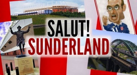
The departure of Martin O’Neill came at an unexpected time and his image has continued to appear at the top of each page of Salut! Sunderland as part of Jake’s montage of Sunderland-related illustrations.
The choice was between tinkering with the old and replacing it with something new.
Should this …
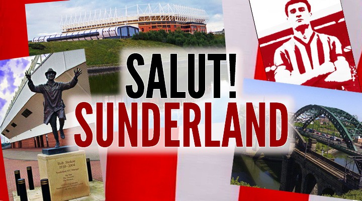
become this, with a Roker legend taking MoN’s place in the top right corner? …
I was not entirely sure of the right answer. I knew I did not – not yet at any rate, until we see what happens in more ways than one – want the new head coach to appear there, although I do stand by my declared position of having moved on from the polemic and wanting only to wish him well in the formidable task he has taken on.
In the end, a real change seemed the way forward and and Jake’s oval image achieved a perfect blend of simplicity and style. Thanks, too, to Sam Haseltine, Salut!’s web guru, for responding as quickly as possible after a first wedding anniversary break to the request to make the substitution.
Let us know what you think. And let’s hope everyone’s efforts are rewarded with what we know to be needed on the field (even Sam, a West Ham supporter, wants to stay up especially if it is at Wigan’s expense).
Well JEL’s prediction is a bit strange and I am still trying to work it out, but his comments on the layout could have some merit and justification. To be fair I’ve kind of got used to it so don’t rally have a preference one way or the other but I can understand if it sometimes feels disjointed or unlinked to new folk.
I think everyone connected with the production of the site deserves a big congratulation, but is it time for a refresh or is it just change for change sake. Best left till next season anyway.
Sorry if it sounded confusing,must have been I was deep in my own train of thought. I was thinking of the outcome of the Mags last 3(?) matches, not including last nights, when they have been losing or drawing ( I would have to check back for exact results) and Cisse has snatched a goal in the dying seconds of stoppage time to get a result. That’s why I will be anxious for the final whistle, obviously I’m also hopeful that something will be at stake for us to defend at that stage.
Well, I’ve been lurking on this site for a while now, a 50 year Sunderland fan, most of that time far far away. While I enjoy the (on the most part) intelligent debate, one aspect of the site has been an irritation from day one, and this discussion about the new logo has finally got me to put my head above the parapet, Not to put too fine a point on it, the layout sucks!. Please please make up your mind how many columns to have on the page and only vary it when necessary. Same way, have some consistency with fonts, style and colour of text. The old adage on design is KISS – Keep It Simple Stupid!. On this page alone there are sections with 1. 1.5, 2,3,4 and 6 columns and too many fonts styles and changes of colour to count. I’m not making this point purely for aesthetics, but for me at least it can be difficult to follow the thread of an article that jumps around the page and might suddenly change into italics for unknown (at least to me) reasons. I’m suggesting it’s the time of year for a little Spring cleaning, I’m just ho hum on both versions of the new logo, but I think a much bigger impact could be made by just visually simplifying the page.
There, I’ve said my piece, I’ll still be visiting the site whatever, and I’ll be watching every minute on Sunday from afar, my forecast – there’ll be 90+ minutes, and then there’ll be the last nailbiting 90 seconds.
Interesting post and it goes back to some points Malcolm Dawson, I think, made a while ago. What does MD think? Others?
I like it., It looks great.
My vote would go to the new ‘old’ one as the stars & stripes did immediately make me think it was a U.S. site… even though I know M. Salut comes from Shildon
“Retro” I like, “Dated” not so good, although I, like a good percentage of the regulars on here, am well past my sell-by date!
Like tge overall retro feel about new logo…though I’m not too sure about the 10 stars?Can’t be reference to our outfield players, that is for sure.Stars and Stripes…isn’t that a bit Americanised?
So what do then stars represent?
The New logo somehow seems a tad more dated than the old one but perhaps it is the stars that make me nervous .
Is it just me seeing them as a result of some pending shock or perhaps it is tempting fate as we have seen little evidence of them on the pitch this season.
Perhaps they are a figment of DC’s imagination which aspires to being able to field a team blessed with the fitness to last an entire game, playing at the level expected of professional footballer.
Perchance it is a dream of the glory yet to come but knowing Salut and the pressure that he works under it is probably a design he ran off for an American beer label after all we have watched a season largely made up of nat’s piss performances.
The word Sunderland’s season “Draws” to the close because we have had too many of them in Games we should and could have won.
So I will be off for a lunch time Bevy to Toast Saluts Sunderland version of the Stars and Stripes
A T Hedley
You beat me to it, I was writing mine as you posted the same.Great minds think alike
Prefer the old one.
A Pear Shaped one would have been required had we persevered with MON, and may still be…in Paulo we put our faith.

Much prefer the one featuring King Charlie and Bob Stokoe to the one in current use.
Maybe, the American friend that you refer to in:
https://safc.blog/2013/04/newcastle-united-v-sunderland-guess-the-score/#comment-32779
Was allowed more input than he should have been!
It’s hideous!!
Well JEL’s prediction is a bit strange and I am still trying to work it out, but his comments on the layout could have some merit and justification. To be fair I’ve kind of got used to it so don’t rally have a preference one way or the other but I can understand if it sometimes feels disjointed or unlinked to new folk.
I think everyone connected with the production of the site deserves a big congratulation, but is it time for a refresh or is it just change for change sake. Best left till next season anyway.
Sorry if it sounded confusing,must have been I was deep in my own train of thought. I was thinking of the outcome of the Mags last 3(?) matches, not including last nights, when they have been losing or drawing ( I would have to check back for exact results) and Cisse has snatched a goal in the dying seconds of stoppage time to get a result. That’s why I will be anxious for the final whistle, obviously I’m also hopeful that something will be at stake for us to defend at that stage.
Well, I’ve been lurking on this site for a while now, a 50 year Sunderland fan, most of that time far far away. While I enjoy the (on the most part) intelligent debate, one aspect of the site has been an irritation from day one, and this discussion about the new logo has finally got me to put my head above the parapet, Not to put too fine a point on it, the layout sucks!. Please please make up your mind how many columns to have on the page and only vary it when necessary. Same way, have some consistency with fonts, style and colour of text. The old adage on design is KISS – Keep It Simple Stupid!. On this page alone there are sections with 1. 1.5, 2,3,4 and 6 columns and too many fonts styles and changes of colour to count. I’m not making this point purely for aesthetics, but for me at least it can be difficult to follow the thread of an article that jumps around the page and might suddenly change into italics for unknown (at least to me) reasons. I’m suggesting it’s the time of year for a little Spring cleaning, I’m just ho hum on both versions of the new logo, but I think a much bigger impact could be made by just visually simplifying the page.
There, I’ve said my piece, I’ll still be visiting the site whatever, and I’ll be watching every minute on Sunday from afar, my forecast – there’ll be 90+ minutes, and then there’ll be the last nailbiting 90 seconds.
Interesting post and it goes back to some points Malcolm Dawson, I think, made a while ago. What does MD think? Others?
I like it., It looks great.
My vote would go to the new ‘old’ one as the stars & stripes did immediately make me think it was a U.S. site… even though I know M. Salut comes from Shildon
“Retro” I like, “Dated” not so good, although I, like a good percentage of the regulars on here, am well past my sell-by date!
Like tge overall retro feel about new logo…though I’m not too sure about the 10 stars?Can’t be reference to our outfield players, that is for sure.Stars and Stripes…isn’t that a bit Americanised?
So what do then stars represent?
The New logo somehow seems a tad more dated than the old one but perhaps it is the stars that make me nervous .
Is it just me seeing them as a result of some pending shock or perhaps it is tempting fate as we have seen little evidence of them on the pitch this season.
Perhaps they are a figment of DC’s imagination which aspires to being able to field a team blessed with the fitness to last an entire game, playing at the level expected of professional footballer.
Perchance it is a dream of the glory yet to come but knowing Salut and the pressure that he works under it is probably a design he ran off for an American beer label after all we have watched a season largely made up of nat’s piss performances.
The word Sunderland’s season “Draws” to the close because we have had too many of them in Games we should and could have won.
So I will be off for a lunch time Bevy to Toast Saluts Sunderland version of the Stars and Stripes
A T Hedley
You beat me to it, I was writing mine as you posted the same.Great minds think alike
Prefer the old one.
A Pear Shaped one would have been required had we persevered with MON, and may still be…in Paulo we put our faith.