Do we like it or do we not?
As night follows day, the release of the new home kit for Sunderland AFC draws an exchange of early fire.
“I like it,” declares Andy Crake at Salut! Sunderland’s Facebook pages. “A modern twist [with] black meshing detail on the collar, sleeves and hem,” says the club. “Too much white, not enough red,” was Mick Goulding’s judgement at the Blackcats e-mail loop.
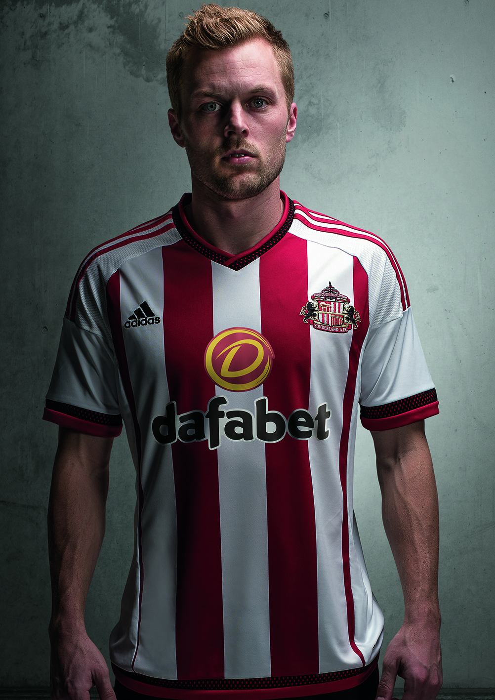
Monsieur Salut? I am instinctively with Andy. It’s smart and looks a lot better when you see an enlarged image of the upper half of the player wearing it. I can live with the logo, too; betting firms pay this part of the rent – they even pay a peppercorn rent here from time to time, which helps with the bills – and dafabet can hardly be expected to say “no, that’s fine, just leave us out of it”.
If I have a quarrel, it is as identified by Mick.
Last season, there were three broad red stripes with hints of two more either side as the player faced the camera (or crowd). Look at the photo of Seb and it has come down to two red stripes flanked by one vertical sliver apiece. Two just seems insufficient.
This quite significant design change may grow on me, and even on Mick and another doubter, Jeremy Robson, who writes:
I think it looks really smart; or at least it would do if it was for somebody else. It’s not a SAFC kit at all to my eye. There’s no need to mess about with kits at all in terms of their main make up; which is in our case the stripes. Put different trim on it and change the texture of the material, the style of neck and collar etc but ha’way man, you can’t mess with our stripes … our new kit does look more modern though. I’ll give them that
But while we may rue the days when we played in red and white stripes and that was an end to it, we may also misremember them.
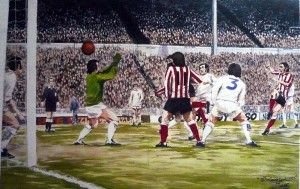
I have seen photos of Ian Porterfield sporting three frontal stripes – as when he scored the 1973 FA Cup Final winner – but also two.
Since I was around in those days, that fact that I had to look it up may suggest these fashion choices matter rather less than the football we watch. And plus ça change, plus c’est la même chose, as one Jean-Baptiste Alphonse Karr wrote in 1849. The more things change, the more they stay the same.
So here is what safc.com has to say about the new home kit:
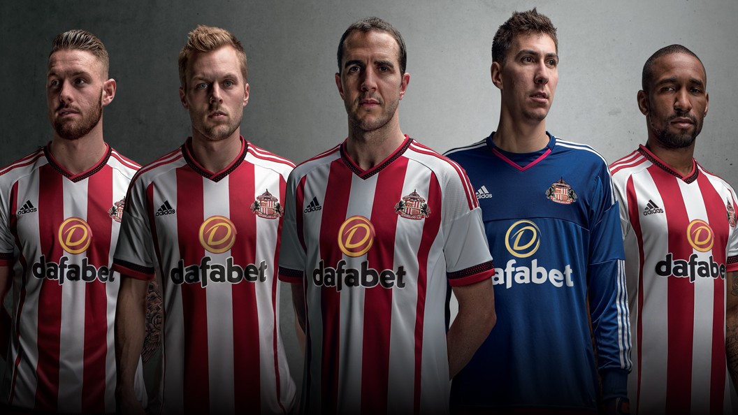
Sunderland AFC has unveiled its new home kit for the 2015-16 Barclays Premier League season, with the new-look strip set to go on sale across club stores on Thursday 18 June. As always, the shirt features Sunderland’s famous red and white stripes, but has been given a modern twist this season by sportswear giant adidas’ cutting edge design team. As one of the world’s leading sportswear manufacturers, adidas are renowned for their quality and innovation in kit design.
In a departure from recent kits, the 2015-16 shirt uses white as the base colour, making the traditional stripes stand out. Adding a modern twist to the garment, there is black meshing detail on the collar, sleeves and hem of the garment and this is complemented by the iconic three stripes of adidas, and finished neatly with red detailing.
Embedded with adidas climacool performance technology, providing a breathable kit on the pitch, the shirt bears the name of the club’s new principal partner Dafabet. This logo will not feature on junior shirts however, due to Premier League regulations.
The shorts are traditional black, set off by a red trim and adidas detailing and the socks are black with a red trim.
Fans can pre-order their shirts now, online at www.safcstore.com. The home kit will go on sale on June 18 and will be available online or in the club’s three retail stores located at the Stadium of Light, The Galleries in Washington or Debenhams in The Bridges, Sunderland.
A brand new away strip is also set to be revealed in the coming weeks
Over to the Salut! Sunderland jury …
Not too keen on the shirt. Too much white and there’s only two stripes. The Dafabet logo looks bit odd.. What’s more, it’s a template design that will be used by other Adidas Stripped teams. Let’s hope we get a better away kit.
I like it , saying that I haven’t bought a brand new strip for years . The last one, which i still wear is a replica of the Vaux top and I wear that as a memorial to yet another of our fantastic Wearside industry’s that was brutally and pointlessly closed , but I digress . I like the new strip and I fully understand the need for sponsorship in every buisness, then I saw the price and choked .
There’s a couple of “Sunderland complete record” books around these days with plenty of photos. Have a look at them. You’ll see the kit always changes and it always will. There are many years when we had a central white stripe. Our preferred central red stripe will return in time. We just have to be patient – and have a bottomless pit of money.
First reaction was that there’s too much white and I don’t like there to be no strip on the sleeves. That’s because I was looking at it like it’s a SAFC kit. If it was someone else’s then I’d have been saying that it looked good.
All this talk of “modern twists” is the euphemism that John’s spellchecker has down as bullocks, because if we go back to propert traditional SAFC kits there wasn’t a huge change from the 50’s the the early 80s. Look at this one in comparison to those shirts and the difference is monumental. One of the biggest gripes that I have is the short sleeves (nothing else these days), when you have players then wearing red undergarments to either stay warm or keep cool. That looks even more crap than any kit we’ve had in years.
To be fair a new design is always going to split opinion. My first thought was ‘good god that sponsor’ but after a few views it really is quite smart. I always liked the 85 shirt and this looks similar in the distribution of the colours. I’m also a central red stripe man but it has to be changed from time to time just to make it differ from the previous season. It would be nice to see a collar or a club badge in the middle for a real change from the norm someday. Don’t like how it’s a common template seen on other Adidas supplied club shirts. Surely they have the capability to design shirts unique to each club, but of course that would cost far too much money on their part. All in all I like it and will be buying it.
It’s smart enough but I’m with those who a) prefer the middle stripe to be red and b) would like a bit more red on it.
Reverse the colours and I think I’d prefer it. I’ll photo shop later and see what it looks like.
But having said that about the middle stripe I’m sure I’ve got a picture somewhere of a 1960’s or 70’s team where the stripes are all over the shop – some with three red stripes, some with four etc. I’ll see if I can find one on line and add a link if I do.
Not the best example but look at this on e-bay. You can see quite clearly the non uniform nature of the stripes. Compare Bobby Kerr to Billy Hughes for example.
http://www.ebay.co.uk/itm/rare-FOOTBALL-SOCCER-Large-ESSO-1969-SUNDERLAND-FC-Team-Poster-/141665359014?pt=LH_DefaultDomain_3&hash=item20fbe9d4a6
Looks like some of them are wearing their shirts inside out or back to front.
{via our Facebook group}
I don’t [like it]. Too much white not enough red. Also don’t like sponsor’s yellow logo
{via our Facebook group}
The white is what I like about it, looks smart, every season though on every team’s kit the sponsors keep getting higher up the top
Many good points raised both for and against the new kit. Personally I like its clean and modern look but have to admit the sponsors logo does look odd. I can live with that in the same way the club lives with their cash injection.
John Mac makes good points regarding fans having to part with their hard earned cash every year but, like it not, that is the way it is now so kit manufacturers will change the design details whether we like it or not.
I prefer this year’s design more than most recent years but accept the comments regarding the stripes.
Clubs don’t have to change. It’s an active, fully informed choice, motivated purely by money.
True but then we don’t have to buy it. My most up to date home shirt has Reg Vardy on it and my most up to date away one was the two blue stripe one – also Reg Vardy.
If I want a shirt with a Sunderland badge on these days I’ll go for one of the classic ones with the ship on the badge or a 37 Cup Final replica.
Exactly, and I’d love to see a boycott, not just of SAFC, but of all premier clubs
Here’s a revolutionary idea, let SAFC be the first club to give away – yes give away- a shirt with every season ticket. It only sounds revolutionary because we’re so inured to the commercialism. I’d be willing to compromise, don’t bother with the Adidas climacool blah, winceyette over a string vest interior would suit our climate. Just give the long suffering fans something in return.
OR the terms of the contract agreed with the kit providers, who’ve paid for the privilege!
It’s the old ‘Cowies’ sponsored shirt, isn’t it?
Just checked and that one had a central red stripe.
Can see, though, why you may have been reminded of it because the sleeves were also predominantly white.
It’s all bullocks. (or so says my spellchecker). The club should be honest and say “It’s another twist on our desire to get every last penny from hard-pressed, recession hit, low waged supporters.”
There’s no need, we’re no. 27 in the world for generating revenue. Change the logo to reflect sponsors if you must, leave the rest alone.
Do I sound angry?
Maybe it’s because I’ve just made another donation to a food bank I’ve been supporting (seemingly for years) while Steven Fletcher ponces around in his Bentley.
4 thumbs down?
Could that be Mr. Fletcher, Mrs. Fletcher and his Bentley salesman, plus his Lamborghini salesman, who’s jealous he didn’t get mentioned?
Keep buying the shirts, he needs to buy petrol.
I’ve, always, preferred a central red stripe rather than white but, apart from that and the sponsor’s logo I think it looks OK.
I noticed that Football Fanzone are speculating as to whether we may have the best new kit in the Premier League!!
Our kit is “red with white stripes”. Therefore the central stripe should ALWAYS be red. This has been a bugbear of mine for years. I didn’t know a new kit was due out. I much prefer to waste my sons money on the away strips (please be blue).