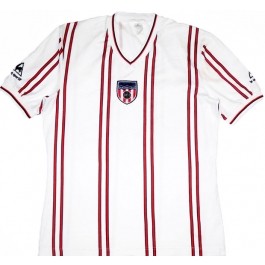
Is it not almost a prerequisite of Sunderland AFC support to regard the shirt you see above as a hideous aberration, a shameless departure from proud tradition to make the passing of the steam locomotive seem a mere detail of transport history? It is not. The shirt has, or had, its champions, as Monsieur Salut has been discovering. We hear all too little from the wise and witty folk who inhabit the Blackcats e-mail list. Here, in the latest from our Beauties and Beasts series, Andy Potts*, a Mackem in Moscow exile, puts that right with a valiant defence of the pin-striped SAFC home top from 1981-83 …
For most Sunderland fans the end of that Le Coq Sportif pinstripe shirt was a huge relief.
Few were impressed with our early-80s attempt to modernise the traditional red-and-white stripes. A new kit deal with Nike prompted an ad campaign announcing the return of Sunderland’s stars in stripes and it seemed the ill-fated flirtation with Euro-cool was over.
However, for some of us, the pinstripe kit was everything we identified with the club. It was what a Sunderland shirt looked like, for better or worse.
My first trips to Roker Park came in the 82-83 season, to watch a team that looked like it was wearing pyjamas sleepwalk its way to a 1-1 draw with relegation bound Swansea City. The pictures on my bedroom wall, painstakingly cut out of the Football Echo or – in full colour! – Shoot! magazine, featured pinstripes, whether home or away. Football stickers, that vital primary school status symbol? Yep, pinstripes there too. The team photo from the club shop? You guessed it … pinstripes. For a seven-year-old, it wasn’t something to have an opinion about, it was just how things were.
The release of a new kit was a huge shock. It might have been traditional, but it wasn’t my tradition. The sponsor’s logo – an SAFC first – might have made us look like a big club (although even as a child I could sense that having the chairman’s eponymous company on the shirt wasn’t quite the same as Sharp or JVC), but it couldn’t distract me from the fact that the only identity I’d ever known for my team had been changed overnight, apparently at a whim.
Basically, I felt pretty much like everyone else had felt two years earlier when the pinstripe and red shorts combo made a debut about as promising as Danny Graham’s.
Looking back, it feels like bad parenting: how could I be brought up by a Sunderland-supporting father and be unaware of the traditional red-and-white striped heritage?
Considering we lived over the road from George Herd, who wore the stripes with some distinction, how had this particular village failed to raise its child to properly respect his roots?
Well, that was the 80s. No internet, no YouTube clips of great games of old. Ian Porterfield’s goal might have graced Football Focus on FA Cup 3rd round day each year, but on Saturday lunchtimes I was out in the street playing football, not watching TV. We didn’t have a video player, and even if we had it’s unlikely we’d have found an extensive back catalogue of football matches available to watch.
Dad’s copy of the club’s centenary commemorative booklet would have revealed all: the team of all the talents, Raich Carter, the Bank of England Club, Shack, 73. But that was still kept safely on his shelves, out of reach of grubby childish hands for years to come. If I saw old footage of players in the stripes, it was most likely to be Stanley Matthews playing for Stoke at an age even greater than my Dad’s. Did we really want to look like Stoke?
The other thing I didn’t realise at the time was that we weren’t unique in tweaking the shirt design. In the early 80s Stoke and Southampton were also fiddling around with the classic red-and-white template (Southampton did quite a nice job of a broad white stripe down the front and back with red sleeves and sides; Stoke, as I recall, had a nasty red/white gauze that appeared grey beneath solid red shoulders).
For all I know Sheffield Utd, Leyton Orient, Paraguay and Athletic Bilbao were up to similar tricks. So maybe I’m not completely alone; maybe there’s a group of fans from other clubs, all of a certain age, who had the same shock.
Times change. A little older, a little more context, too much time on YouTube watching
archive footage.
Now it’s almost impossible to imagine the lads turning out in anything other than red-and-white stripes (although I admit to a hankering for a return to the halved shirts of the 1880s, just for variety). But back in the summer of 1983 there was one seriously unhappy and confused fan (and probably only one) contemplating this brand-new old-fashioned kit.
* Andy Potts on himself: … first badgered my Dad into taking me to Roker Park as a seven-year-old, and saw a relegation-bound Swansea City pick up one of just two points away from home that season. Which, in a nutshell, seems to encapsulate the Sunderland-supporting experience.
Now based in Moscow, he’s eternally grateful for Rossiya Sport 1’s habit of showing games ‘as live’ after staggering home in the early hours of Sunday morning, meaning a good night out is no longer subject to the afternoon’s results. See more at http://www.wayn.com/profiles/Andymackem
It wasn’t so much the shirt I objected to – it was the shorts. When I first went to Roker Park we wore white shorts. I got used to the black, though it took some time and now wouldn’t want to see us in anything else as a first choice but never red.
The red and white halves were indeed an early kit but our original shirts were blue. Tradition eh – it’s not what it used to be.