* a new manager who seems to be developing a positive work ethic and has promised an entertaining style of football
* new signings within budget who are all speaking highly about Sunderland AFC and their delight at coming to Wearside
* players who do not wish to buy into the club’s future given short shrift with a promise that the club will not be taken for a ride by players and their agents
* the beginning of the replacement of the pink seats, an increasing involvement of the fans, an acknowledgement that supporters are the club and a repairing of that damaged relationship.
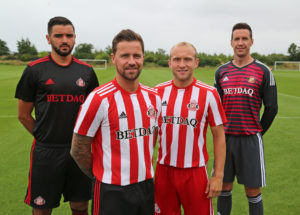
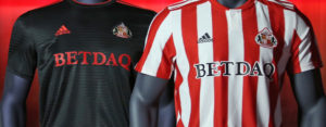
This afternoon has seen the launch of the new season’s home and away kit and again Stewart has shown that he is not talking rubbish. A few weeks ago he told us that while the designs had been agreed long before he took control we, as fans, would be a lot happier with the new shirts and I can’t envisage anyone, who thinks last year’s effort was superior to those unveiled today. Well the home kit at least. (See it here on safc.com)
Courtesey of www.safc.com
The change strip is a rather smart black but this time Adidas and their marketing team haven’t tried to win us over by pretending it was chosen as a mark of respect to the area’s mining heritage. This time just let it stand on its own as a smart piece of kit. I like it.
I expect the supporters who watch the boys run out at Darlington tomorrow will feel just as positive about one more tiny piece in the feel good jigsaw.
Ha’way the Lads.
Yes Malcolm very poorly made, but that was some team. Tueart, Joe Baker Gordon Harris and Colin Todd all English internationals in their day
True Keith. Naff shirt, decent team, unlike last season’s crap shirt, crap team combo.
I have always believed and tradition supports this, that the centre stripe should be red.Stoke have a central white stripe. It certainly looks better that last seasons pyjamas
In the majority of historical photos the middle strip is red Keith but I love this picture which would seem to suggest these shirts were made by pupils in the 1st year needlework class at Southwick Secondary School.
https://www.pinterest.co.uk/pin/797348308997913235/
Hope this link works
Stripes on the back make the numbers and names difficult to read. That’s why they go for either a plain back or a large square. It’s better than last years and makes us look like Sunderland again and not an ersatz Sheffield United. Anyway, we have no idea who the players are, so we will need the names to be legible from Row 31 in the East Stand.
Did not appreciate no “rear “stripes until read same.
An “own” goal for me .
I remember European games from years ago when the shirt numbers were obscured by shirt stripes. Juventus in particular. Then the numbers were stitched onto a white square of material which itself was stitched onto the shirt. The mags were in Europe at the time IIRC. I’m sure, despite what the media say, that EUFA required numbers to be on a plain panel background. I voted thumbs up before seeing the rear of the shirt. Don’t like it but it is a seismic leap forward from the shambles of last season. Browsing the club shop shows the amount of tat produced by adidas that the club have to spin as being marketable. They could at least provide us with a measly shirt we want. Immaterial to me though. I hide my 66 year old XL pear-shaped body behind my virtuous claim that I won’t buy anything bearing a gambling sponsor’s logo. Beer I can live with although Tuborg was stretching it a bit. Wouldn’t it be nice to have no logo?
How many people who voted that it’s “just the job” know that there are no stripes on the back?
Without stripes on the back it is not a Sunderland shirt and I won’t be buying it.
Perhaps that’s why all the early pictures were front views?
No stripes on the back !! Better than last year, obviously – what wouldn’t be. But compared to the club’s proper, traditional strip it’s still sh* te
Latest reports seem to suggest that plain backs is an Adidas design policy and applies to all their striped shirts. If that’s true then it looks like we’ll be stuck with plain backs for as long as they are our kit suppliers.
Whoops sorry lads. Did I mention ar*seholes without also referring to R*dwell in the same sentence?
Two ex Sunderland stars in an England team in the semis of the World Cup.
Sun beating down like there’s no tomorrow.
Its been a while since any of those.
Now that’s a Sunderland shirt. Champion. It will also look a load better without a horde of overpaid ar*seholes filling them.
Big thumbs up from me. Red shorts? I’ve got images of Brian Heslop and Bruce Stuckey in my head now.
Could be worse Terry. At least they’ve replaced those of James Vaughan and Brendan Galloway.
The club e-mail says the home kit also has interchangeable red shorts and features red socks. Since posting this I have seen pictures with black shorts and socks worn together.
My preference is for black socks but clarification may be needed before I can say for certain what the first choice will be at home.