Matthew Warburton, writer and Sunderland fan, looks back at the striped but also – figuratively – chequered history of the SAFC home kit …
Sunderland AFC have been around for a long time; since 1879, as any properly educated schoolboy would tell you.
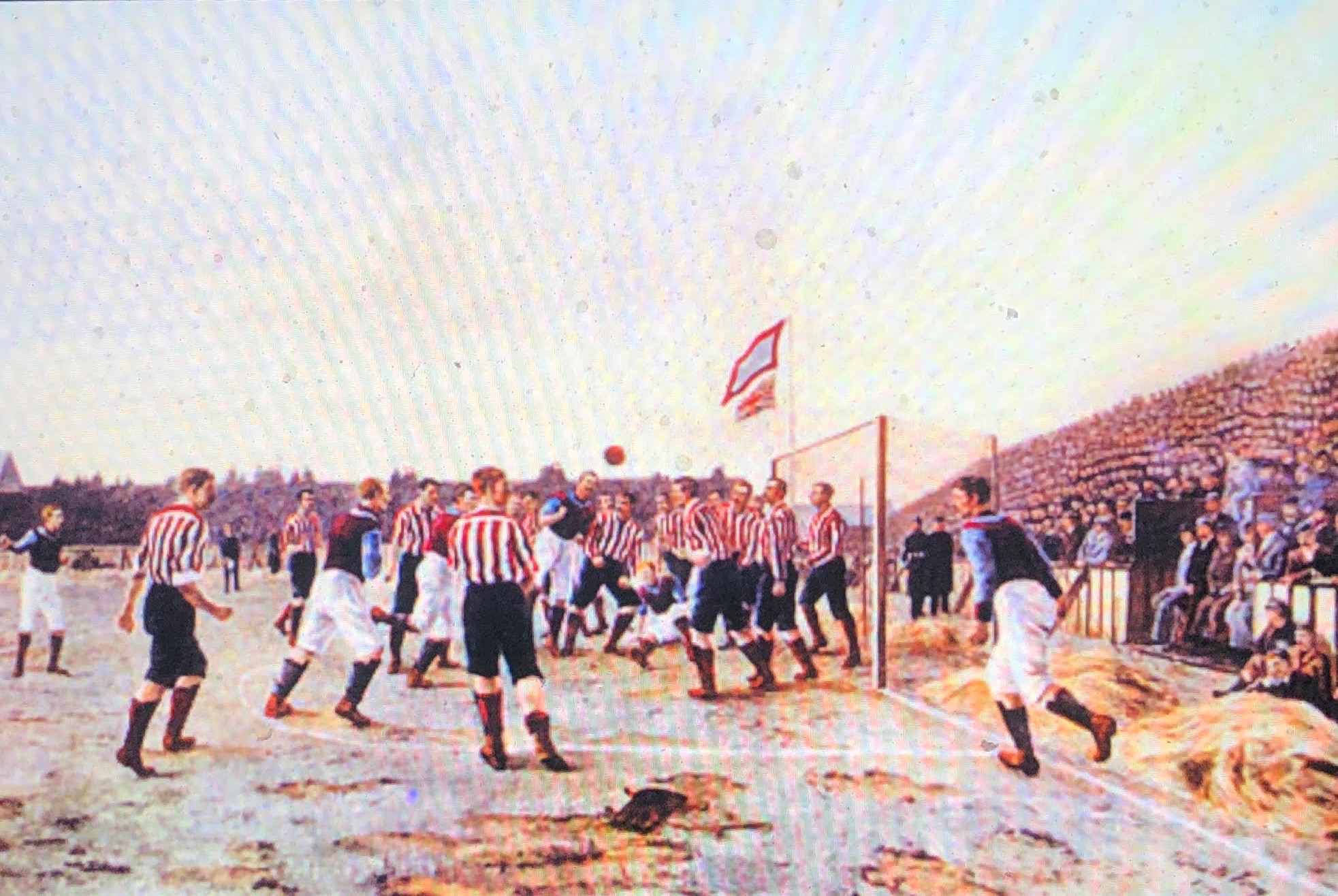
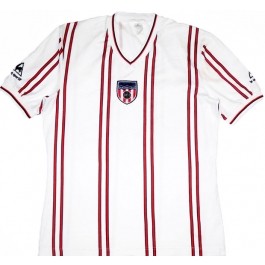
As fans, we’re quite proud to say that the home kit hasn’t changed too much since the early days of the club’s history. Although the first few seasons the team wore navy blue, since 1884, it’s all been about the red and white. Here we look back through time at Sunderland’s home kit.
Though the design hasn’t changed too much, the designers have. In 1975, it was Umbro, then Le Coq Sportif in 1981 (the ones who made such a pinstriped mess of the traditional design), followed by Nike in 1983, and then Patrick, Hummel, Avec, Asics, Nike again, Diadora, Lonsdale before heading back to Umbro.
Thankfully, Sunderland has stuck with Adidas since 2012, and they seem to be doing a pretty good job, last year’s effort aside.

This year, the kit looks more like a proper Sunderland kit, with traditional wide red and white stripes, a round collar and less of the crap. The shorts are black (or red on occasion) as are the socks.
Shirt sponsorship also didn’t start until later in the history. Our first sponsor was Cowie’s in 1983. Then it was Vaux (or Vaux Samson) for many years. Lambton’s beer made a famous appearance in 1997, and then Reg Vardy held the contract from 1999–2007.
It’s only since 2007 that the sponsorship deals have been short lived. There’s been Boylesports, Tombola, Invest in Africa, Bidvest, Dafabet and Betdaq. Don’t be too surprised by the influx of betting companies. Around half of Premier League teams now have an iGaming sponsor on their shirt, and this is becoming increasingly normal across all divisions.
Changes to the design have been little and not often. Since 1987, we’ve had the popular red and white stripes that have evolved to this day. In the 1913 FA Cup Final, the team wore the Sunderland coat of arms on the kit, and in 1937, the year after winning the championship for the 6th time, they wore a simplified coat of arms on the kit for many league games as well as the FA Cup Final.
In the early 1960s, shortly after the team’s relegation to the 2nd division after 60 years in the top flight, they introduced white shorts to represent a new start, but the traditional black shorts were brought back as soon as Bob Stokoe became the manager in 1972, much to the delight of fans.
The biggest break to tradition came in 1981 when Le Coq Sportif made a mashup of double stripes that angered a lot of people and was quickly replaced again in 1983.
Any changes to the design since then have focused on subtleties around the collar and shoulders, aside from the bold (but ultimately unwelcome) move toward thinner stripes in 2017. The message remains: fans like the thick red and white stripes, preferably with black shorts!
Simple message to any future strip designer,…..don’t mess with the stripes.
That said,I gave a replica shirt of the old Coq Sportif design to a friend in the USA as a gift,he loved it,he went out wearing it the same day pleased as punch. It wasn’t so bad when you see it now.Though it doesn’t look like an SAFC shirt.Last years was without a doubt the worst in our history.
We are not the only team to vary the red and white stripes, Stoke and Southampton have had their share of horrendous stripy strips too.
As I said above the Coq Sportif looks better and better as the years go on.
It is a very fresh looking design, ahead of its time and perfect for all the saddo’s who wear football tops as T-shirts in the summer.
I might buy one.
If I ruled the world, every day would be the first day of spring…. … And I would pay the club to have NO sponsor on the front of the shirts.
Last season’s kit was a disgrace. When I saw it I knew that we would be relegated. The only positive if there could be such a thing was that at least it didn’t look like SAFC getting relegated in that horrible tat. Whoever agreed to this design deserves whipping. Even worse than the Signal toothpaste job from the early 80s and that was dire.
There is a version of how we came to adopt red and white stripes and that is that we got a kit second hand from Teeside club South Bank. Their colours were red and white stripes with black shorts.
Prior to that Sunderland AFC played in red and white halves following their initial games when they played in blue.
For those that missed it I covered that in our Christmas Advent Calendar series on December 21st.
https://safc.blog/wp-content/uploads/2018/12/December-21-16.pdf
Tx for this article. Very interesting that SAFC may have adopted the red & white stripes from another club. Especially when many historians believe Sunderland and its supporters had a big influence over the shirts worn by clubs in Europe and South America.
And I’m sure I read somewhere that around the turn of the previous century SAFC actually loaned red and white tops to a hard up NUFC.
I actually liked Le Coq Sportif version back in the day. And I think it looks even more cool as it and I get older.
Still the traditional stripes are what the fans want, I’ve no problem with that.
But I think this strip could have made a superb away top rather than the dreary washed out sky blue rubbish they keep regurgitating without any links to the club’s history.